Using Historic Maps with QGIS
This tutorial is the third of three tutorials on getting started with QGIS. The first part of our tutorial covered some basics of QGIS. The second part of our tutorial showed some ways of adding data to a map.
Using Data with Historic Maps
Tools like QGIS afford us new vistas onto historical data. Say you wanted to study the development of the railroad. You could collect and pour over historic railroad maps to analyze change over time. But this would miss out on one of the great powers of mapping tools like QGIS—the opportunity to layer different kinds of data, such as the development of towns along the railways, or a quantitative analysis of track lengths by different railroad companies.
And while it can be very nice to see historic data on modern maps, but it’s helpful to see the historic context as well. This, too, is part of the laying functionality built into GIS software. Let’s walk through this process.
First you’ll need a historic map. You can use, for example, the David Rumsey map collection. We can download a map (say, of railway lines) from the 1860s. We might use something like this map of the Pacific Greyhound Lines.
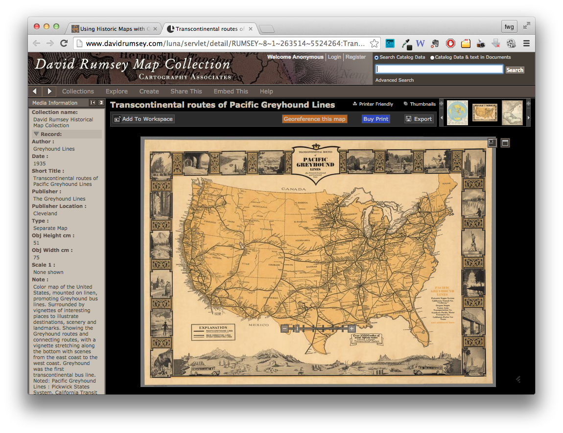
To download your own version of the map, click the “Export” button near the upper right corner, choose at least the “large” size, and save the file with your others for these lessons. This will be good enough for tutorial purposes. It’s nice to have higher resolution images, but they do come with a performance cost (QGIS can seem a bit sluggish), which can be considerable if you have a lot of large images or datasets on your canvas.
Map Projections
Here we must pause to consider map projections, though we’re only going to scratch the non-technical surface of an incredibly complex topic. When just looking at a single map, you might not think much about the particular projection—that is, how a curved surface of the Earth gets represented on a flat piece of paper or your screen. But when trying to line up different maps on top of each other, especially from different time periods, the differences in their projections need to be taken into account. For now it’s enough to say that the projection of a historic map (which might have its own distortions) is unlikely to be the same as a modern map (and might be inaccurate in other ways, too). So we’ll need to digitally warp the old map (kind of like re-projecting it) so that it better lines up with a modern map on which we can visualize data.
Here’s a conceptual description of what we want to do. Pretend you have a reasonably accurate (nothing cartoonish or highly stylized) historic map of the U.S. printed on transparent silly putty sitting atop a modern paper map of the U.S. They won’t line up exactly, but they will be pretty close.
Now imagine stretching your putty map in various directions (push and pulling it at various points, and not always symmetrically) to align it with the modern map. To keep the silly putty stretched out, stick pins through the silly putty at obvious geographic features (coastlines) or political boundaries (state borders) and through the same features on the modern map. As we do this, the two maps will begin to line up very closely in places near to our pins and perhaps less so everywhere else where we haven’t directly lined it up.
In a very crude way, this process “re-projects” the historic map from one coordinate system to another one. It’s more technically accurate to say that we are “geo-rectifying” the map/image by indicating where a spot on historic map aligns with a spot on a modern map in order to distort the original image of a map. This is a more specific instance of “geo-referencing”, which is a generic term for assigning geophysical coordinates to a specific space, whether on a modern or historic map (but doesn’t necessarily involve distortion).
Loading Images
Geo-rectifying a historic map complicates the process of loading an image into QGIS, so let’s start with the simple example of just loading an image.
Load a modern raster image
The map we’ve made so far is totally flat; let’s add a bit of terrain. We can do this by adding a raster image of topographic features (a visual representation of elevation data). Get an “shaded relief” image from Natural Earth by clicking the “Download small size” button.
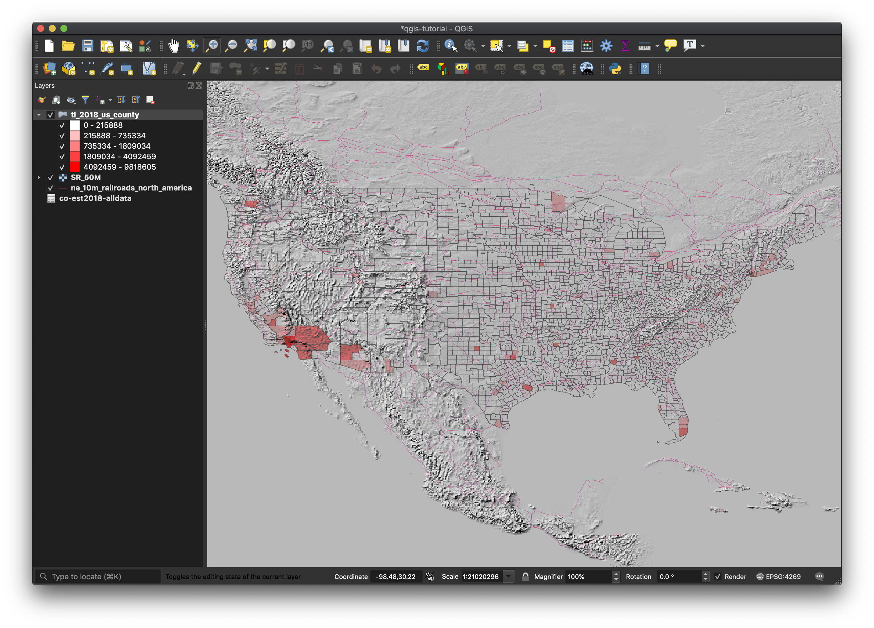
Once downloaded, you can add this image to the map in a similar way as the other layers we’ve added. Unzip the SR_50M.zip file in your folder of tutorial files (which gives you a SR_50M folder), bring up the Data Source Manager, select “Raster” from the left, click the 3 dots and, within the SR_50M folder, select SR_50M.tif. Right click on the layer and “Zoom to layer” to center our image.
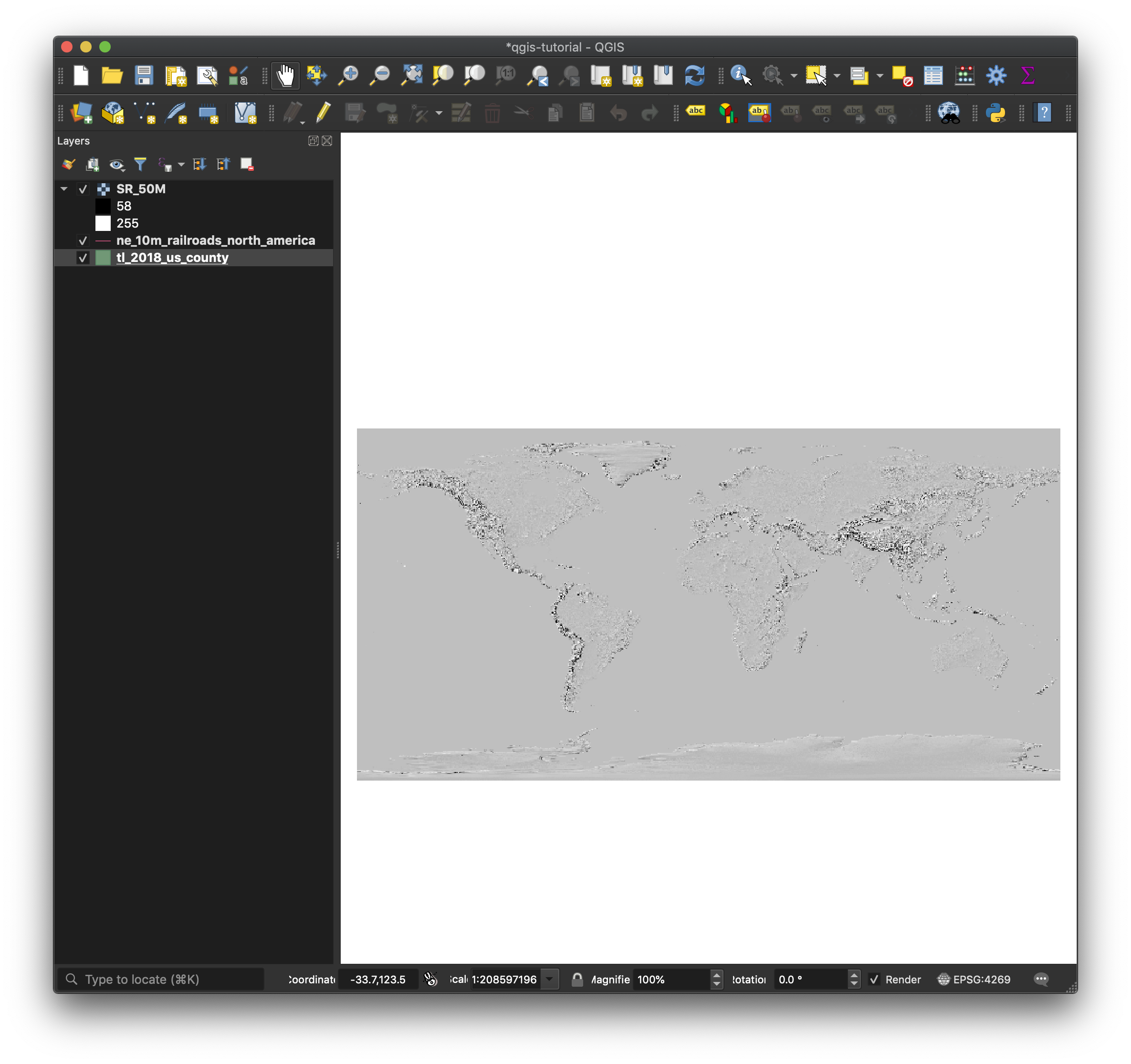
You can see that this image has obscured our county map, so let’s rearrange our layers. QGIS layers the data on the canvas as they appear in the Layers pane from bottom to top (so what’s on top obscures what’s beneath it). Drag the county map layer above the image layer we just added.
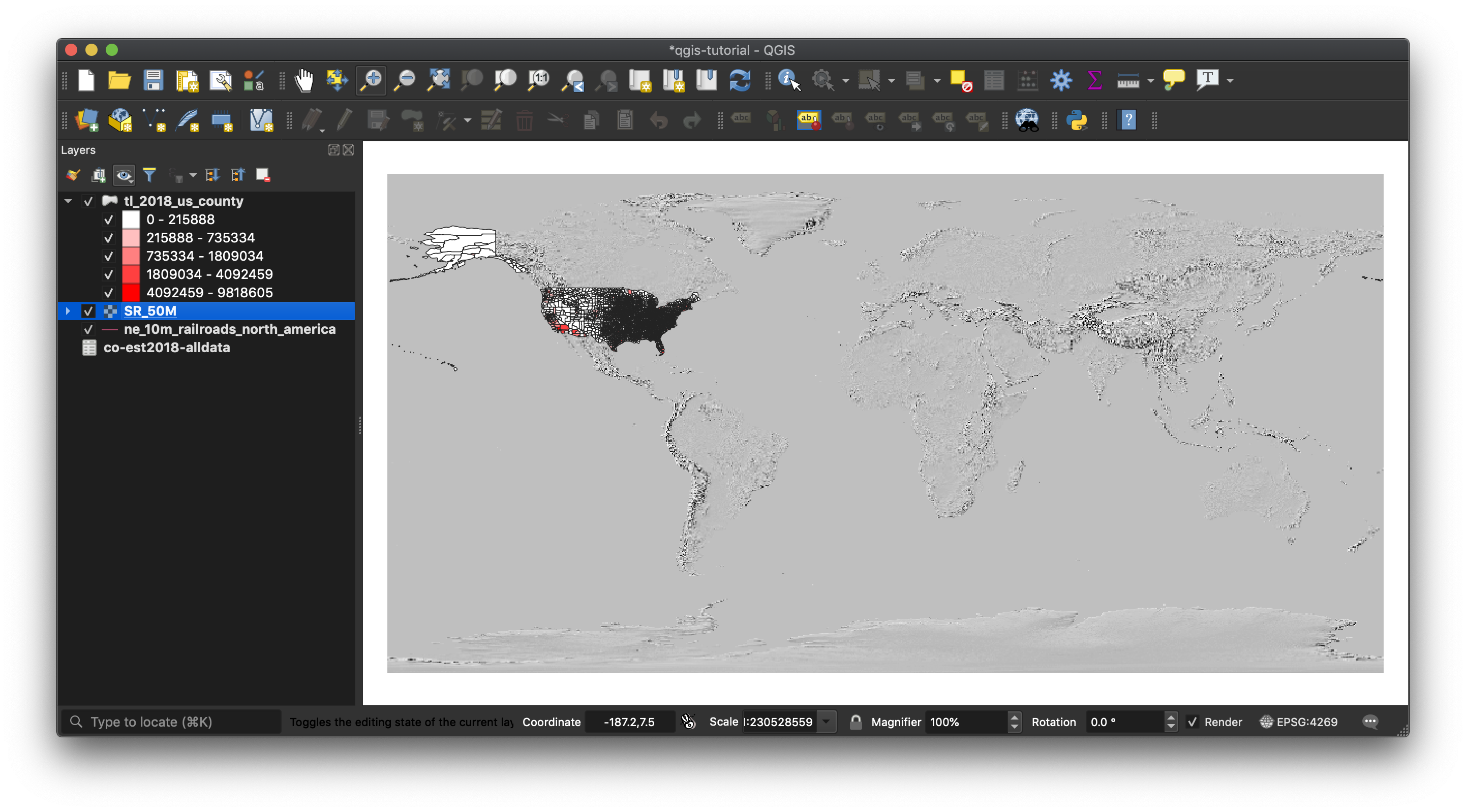
Let’s zoom in a bit to see the continental U.S., which reveals a bit more detail.
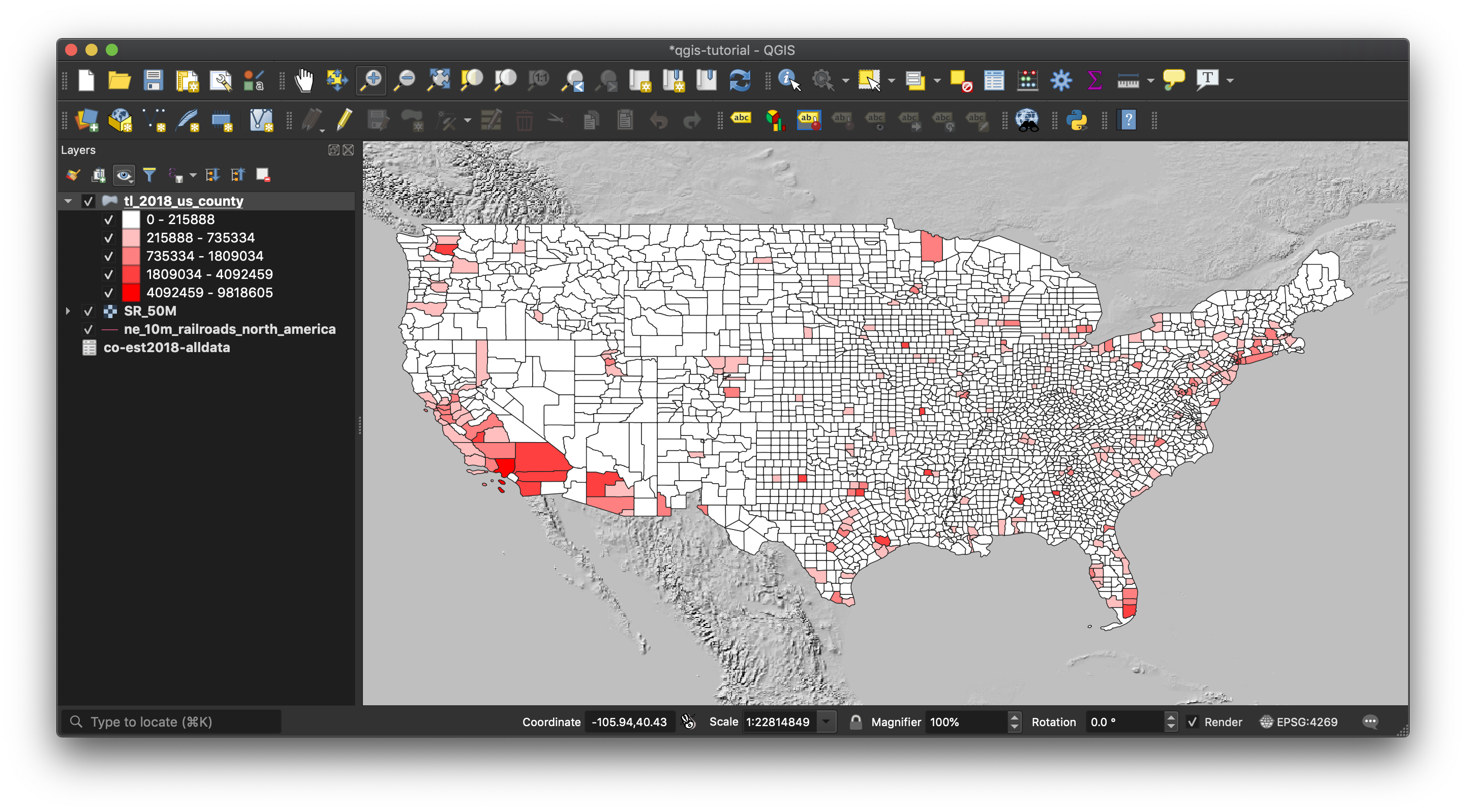
Let’s blend the layers a bit rather than just overlay them. In the “Symbology” submenu (not “Rendering”): in the Properties menu for the county boundaries layer, click the arrow next to Layer Rendering near the bottom and set Layer Blending Mode to “Darken”, and the “Layer Opacity” to 80%. Click “OK”. This will enable us to see more of a blend of the county data atop the topographic data. It’s kinda fun to play around with these setting to see what effects you can create (some of which are decidedly more helpful than others).
Load a historic raster image
For now, “Zoom to Layer” of the county boundary layer.
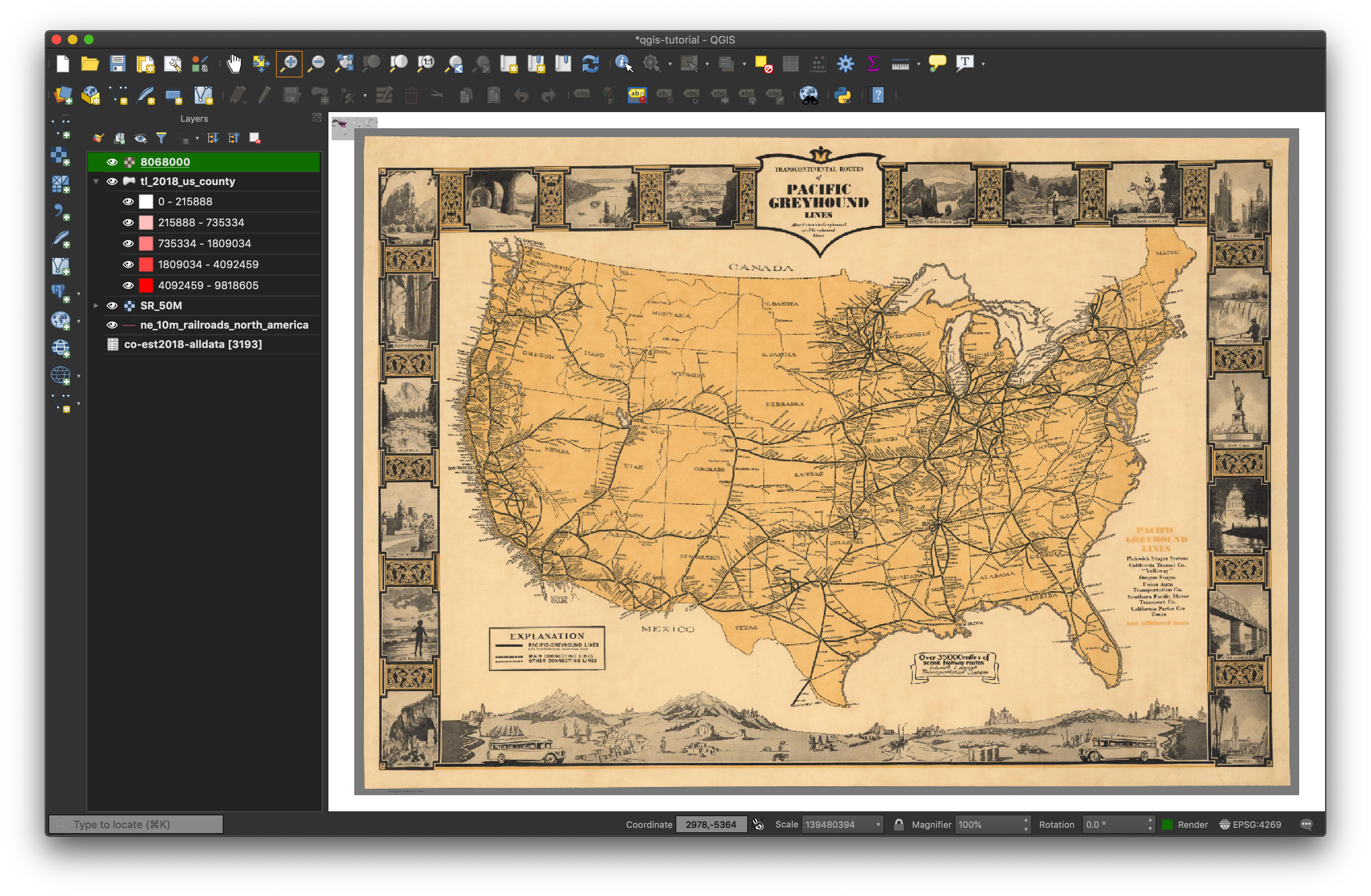
Now, let’s load our historic map the same way. Bring up the Data Source Manager, and select “Raster” from the left menu. As usual, click the three dots to select your file, and choose the Rumsey image you downloaded. It will be named something like 8068000.jpg.
After you click “Add”, the “Coordinate Reference System Selector” dialog box will open. Here QGIS is trying to figure out how to align raster image to the vector map. Just press “OK”—you know you want to—and we’ll hope for the best. Close the Data Source Manager dialog.
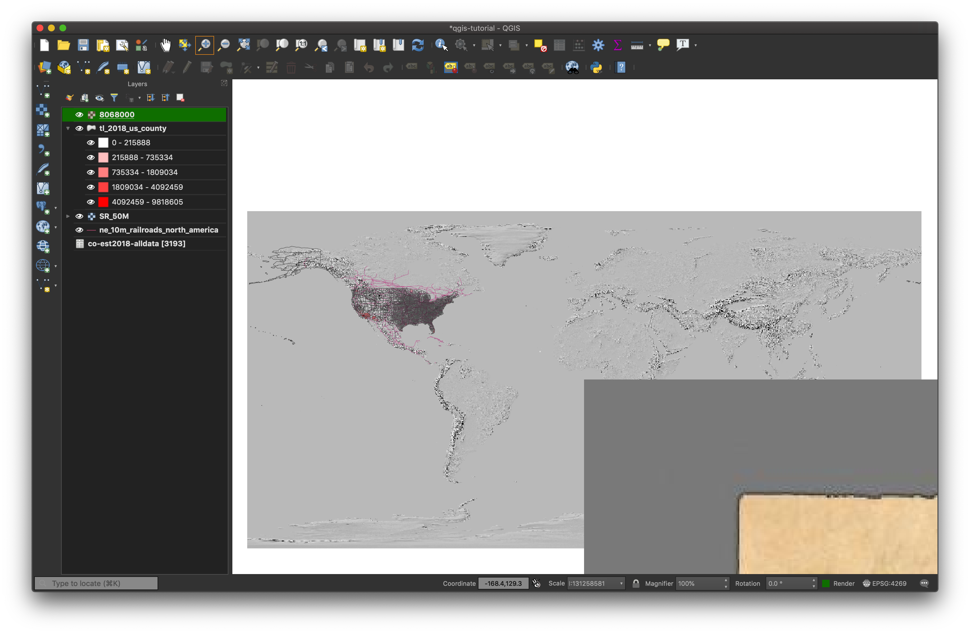
Maybe not what we were hoping for. We can see a part of our historic map on our canvas—note that the upper left corner of the image is placed in the middle our topo image. Shockingly, QGIS did not magically do what we wanted and line up the historic map perfectly on the modern outline of the U.S. So much for artificial intelligence. We can get a better view of our new image by zooming to the extent of the historic map layer.
In reality, since the digital image file of our historic map did not include any Coordinate Reference information (most don’t, only in cases where someone has done the work we’re about to do), there was no way it could align with our existing layers.
But wait! How did we load the image of elevation data so easily? The modern topo map we downloaded was generated according to a modern projection and the image contained metadata that specified how it should be displayed geographically—and therefore how it should be aligned on our map canvas. A scanned map such as a historic map of railway lines often will not have projection information associated with it. We’ll rectify this shortcoming in the following section. For now, right-click on the historic map image and click “Remove Layer” so it’s not in our way. Return your map view to the Layer Extent for your county map.
Using QGIS to Overlay your Historic Image
Our first step is to “georeference” our historic map. As already mentioned, to georeference a map means to associate points on a (historic) map image with points on a modern vector map. QGIS makes this easy. The idea is to load an image of a map into QGIS, mark at least three points on the raster image (our historic map) and where they correspond to the vector image (our map of counties).
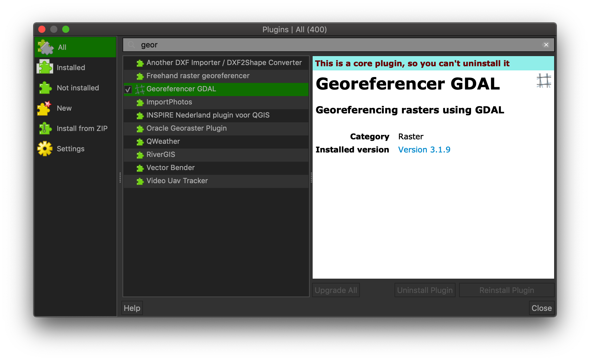
Although the Georeferencer is part of QGIS, it needs to be enabled explicitly. On the menu bar, click “Plugins” (to get the above dialog) and search for “georef”. You’ll see one of the results is Georeference GDAL; click the check box next to it to enable the plugin. Close the plugins dialog.
Plugins are a standard feature of open source software like QGIS. This approach allows different groups to independently write, improve, and maintain code for different facets of a large and complicated application like QGIS.
Before proceeding, use the Zoom tool to draw a rectangle around the continental U.S. so that it fits entirely within the map canvas
Now, under the “Raster” menu, choose Georeferencer to bring up the Georeference dialog.
Once the dialog box appears, click the upper left icon to load a new image, and select the map you’ve downloaded. The “Coordinate Reference System Selector” dialog will appear again, and we can accept the defaults. Once it appears, we’ll begin the georeferencing process (assigning modern geographic coordinates to points on the historic map).
CAREFUL: To georeference a historic map, we must load it through the Georeferencer, not through the Data Source Manager.
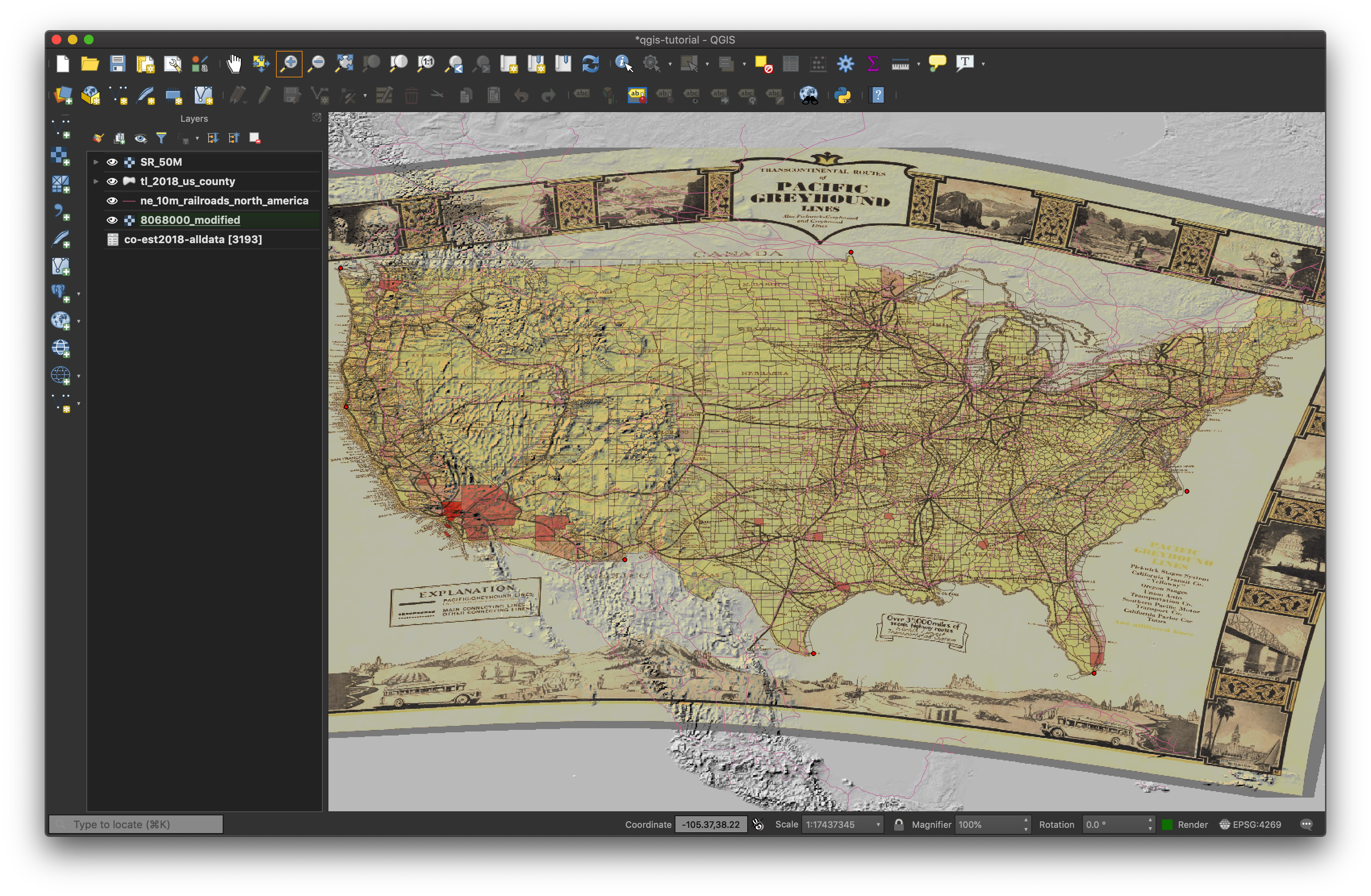
Click the “Add Points” icon to begin. Then, click a point on the historic map to which you want to assign coordinates (say, the southern tip of Florida).
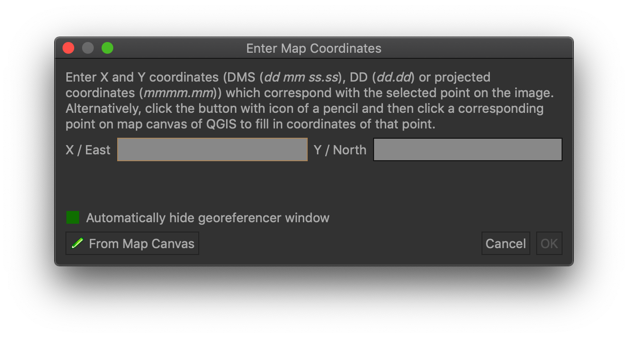
The dialog box that appears allows you to enter the coordinates manually, but it’s almost always easier to simply click on a corresponding point on our vector image of the counties. Click the “From Map Canvas” button, and the Georeferencer will automatically minimize to reveal our canvas. Choose the corresponding point on the county map, and click “OK”.
Repeat this process, choosing a handful of points around the perimeter. You need at least 3, but more distributed points provides a much more accurate overlay. For tutorial purposes, you don’t need to spend a lot of time with the precision of your dots.
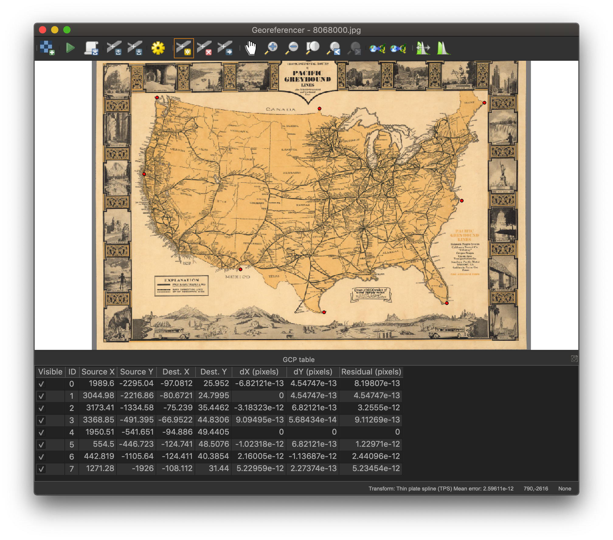
After you’ve entered 6-8 points, click the yellow gear icon to adjust the Transformation Settings.
For Transformation type, choose “Thin Plate Spline”; for Resampling methods, choose “Cubic Spline”. You can read about what these do if you want to remember why you hate math. Depending on how you need to warp your historic map, some of the settings are more appropriate than others, but that’s for another tutorial.
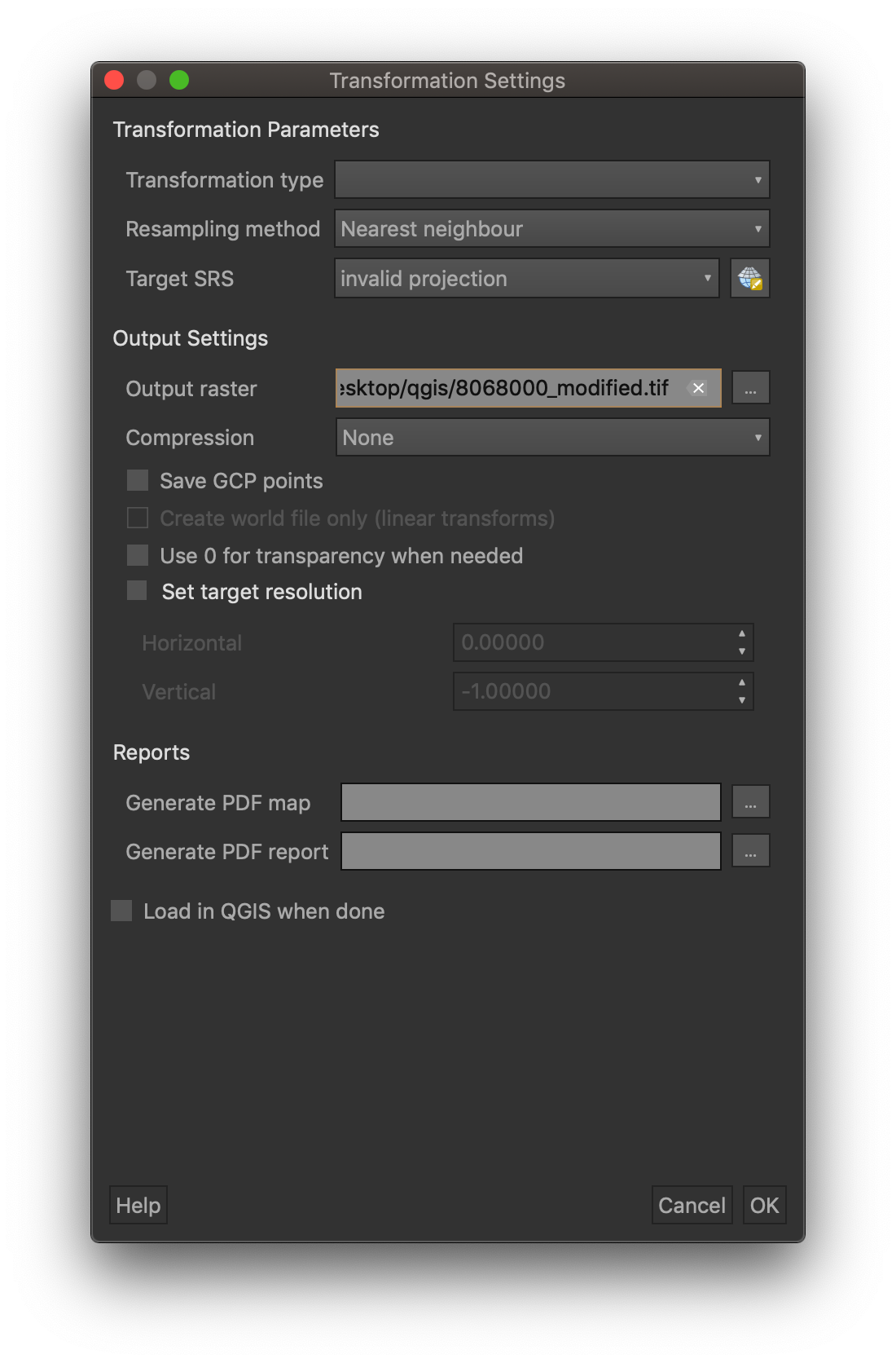
On the Output Raster line, notice that QGIS has automatically suggested a filename (the original filename + “_modified”) to be saved in the directory from which you loaded the original. Saving the file makes it easily available for reuse in other projects without having to repeat the georeferencing process—super helpful for when you’ve spent a lot of time aligning many points.
Make sure to check two boxes:
- “Use 0 for transparency when needed”
- “Load in QGIS when done”
After you’ve finished with the transformation settings, click the green arrow icon (right next to the load image icon). When the Coordinate Reference System Selector appears, click “OK”. Your view will probably be a little zoomed in, so zoom to the extent of the county map again.
You can see we’ve georeferenced the image to more or less align with our county map! And you can see from the edges of the map what kind of warping the algorithm did to the image of the railway map.
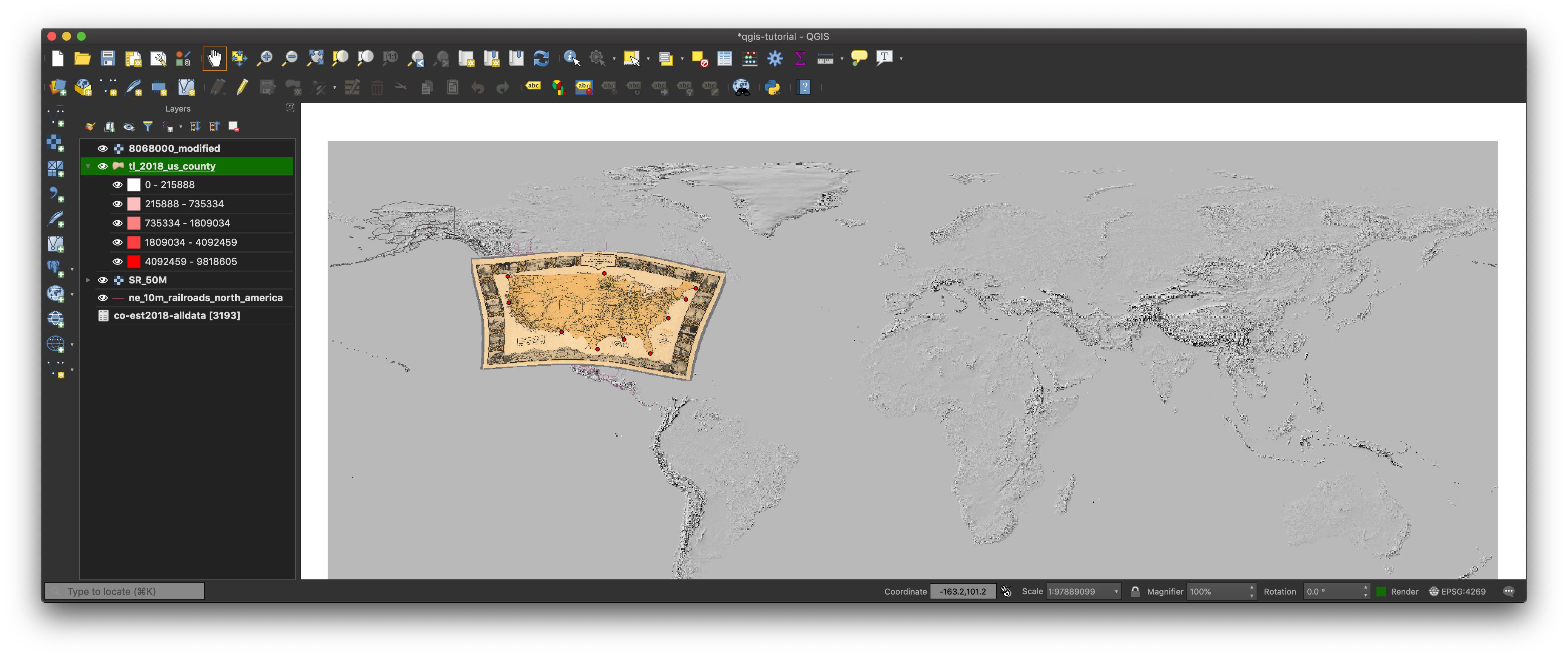
If you see an ugly black border, you failed to check the box for “Use 0 for transparency”. Bring up the Layer Properties dialog, select the “Transparency” tab on the left, then set (in the upper right) the “Additional No Data” field to be 0 (zero). Click “OK”.
NOTE: Since we saved a georeferenced version of our railway map, we could also load it as we did our topo image and it would automatically get placed in the right place. If you try this, make sure you load the _modified version of the file, not the original.
Improving the visualization
We’ve got everything loaded properly, and this is indeed an impressive achievement to have so many different kinds of data on our map in such a short time. Let’s futz with the display settings a bit to make the data more visually useful.
First, let’s rearrange our layers for better visual effects. From top to bottom, let’s try:
- County outlines (from census.gov)
- North American Railroads (from Natural Earth)
- Historic Railway Map (from David Rumsey map collection)
- Topographic image file (from Natural Earth)
- County demographic information (from census.gov)
And we should end up with something like:
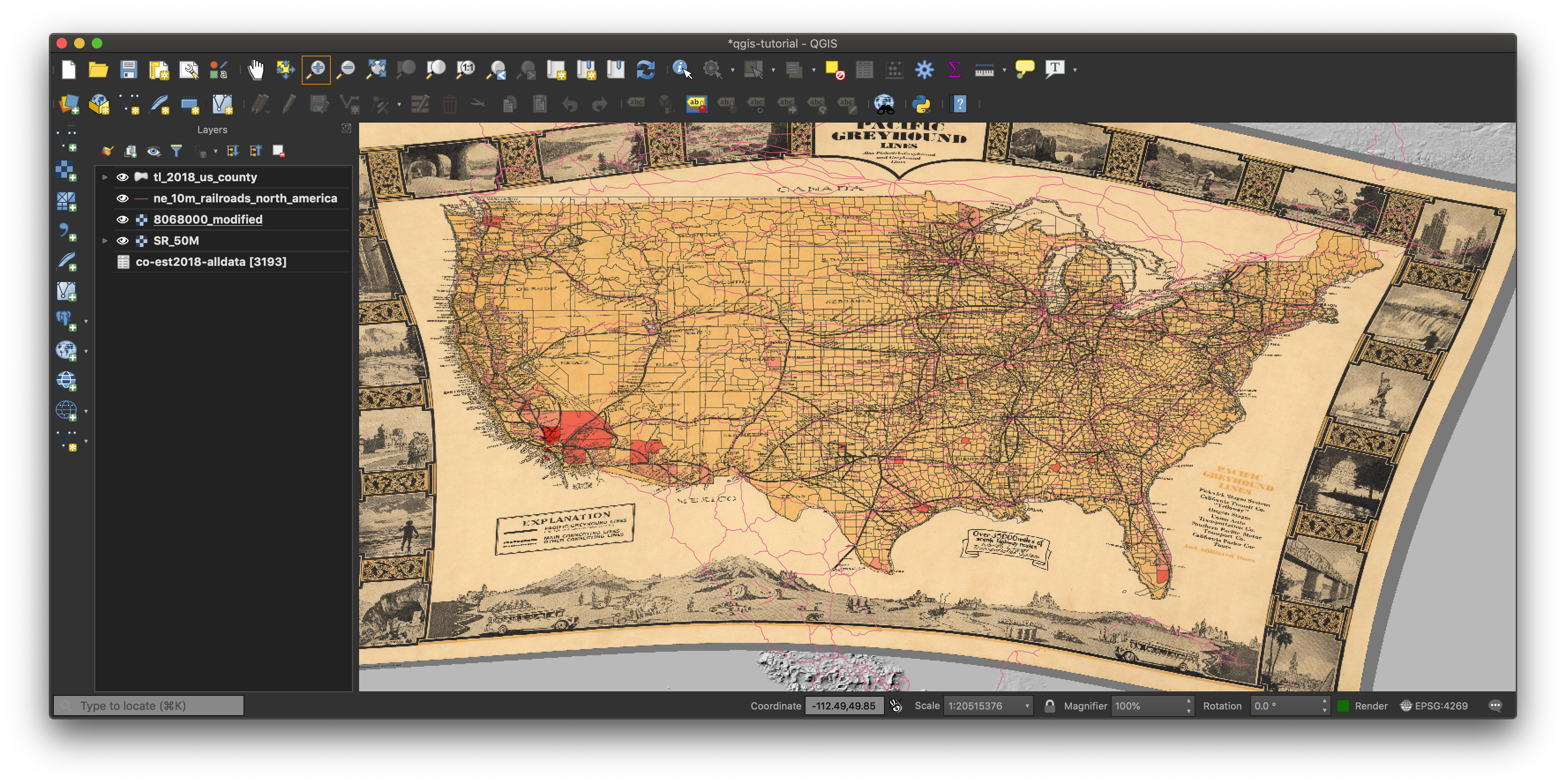
This is more usable, but we have buried the topo image. Let’s move it to the top, then choose the Blending mode to be “Darken”. Obviously you can play around with blending options, transparencies, and so on to acheive whatever visual effect you’re going for.
Needless to say, this kind of map isn’t going to win any cartographic design awards. But the point here wasn’t to make a beautiful map (though some tutorials for that process are forthcoming) but to understand some of the basics in layering data and getting different kinds of data together on a map.
Happy mapping!