Consider the Poster
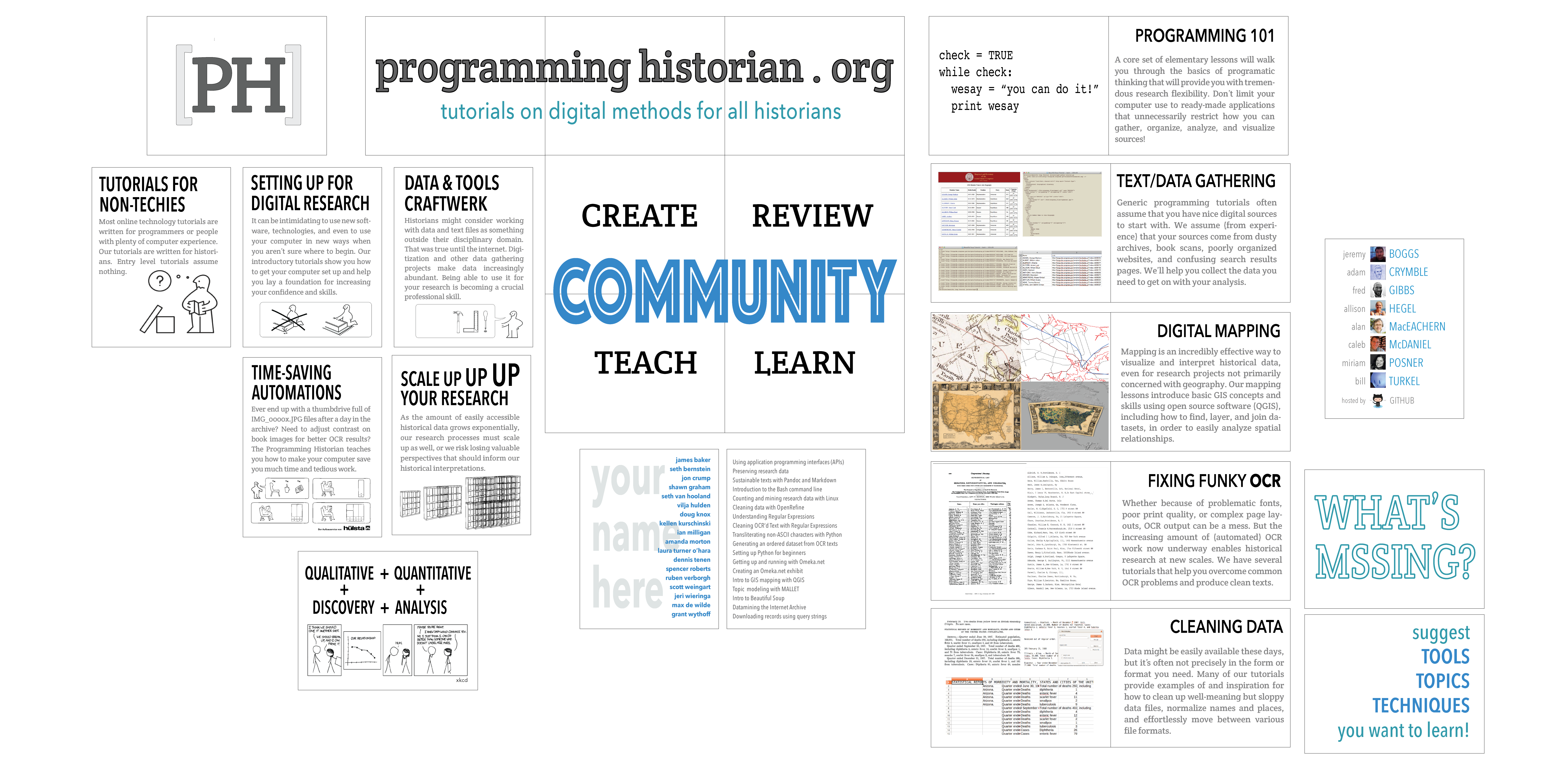
At the AHA 2015 meeting in NYC, I had the opportunity to present a poster that featured the tremendously valuable tutorials at the Programming Historian. Click on the digital version below to get a much larger version, and get ready to zoom and scroll.
A New Perspective
Although papers, sessions, and workshops reign supreme at AHA, the conference organizers have been most encouraging and welcoming of posters. They have, for instance, made excellent arguments for the advantages of participating in the poster session from a professionalization standpoint (it provides wide exposure; allows more interaction, etc), as well as provided quite helpful suggestions and resources for making a good poster.
However, this otherwise helpful justification begins with what I consider a misguided suggestion: “If your work lends itself to visual presentation-photographs, maps, material culture, or statistical evidence that can be presented graphically-think about proposing a poster.” All true, but posters should not be limited to projects that have a strong visual component. This post explains 1) why making a poster benefits almost any project, and 2) why the process should be valued as much as the product.
I’ve been happily working, along with the rest of the project team, as a general editor of the Programming Historian for almost two years. I talk with the other general editors about once a month about how to make the site better. In addition to the usual discussion of the lesson pipeline and improving our editorial processes, this has also included many conversations about reorganizing the underwhelming homepage (coming soon!), making a more intuitive way of showing off our fabulous lessons, and better soliciting participation from those who want to write or review tutorials. (Let me know if you’d like to contribute!) The point is that I’m not so chin-on-the-keyboard immersed in editorial work that I don’t have motivations or opportunities to think about the big picture. Yet it turned out that the poster was a unique opportunity and motivation to get a new perspective as a result of the design challenge.
Value of Design Challenges
Limitations fuel creativity and insight. If you could express your ideas however you like, you’d probably choose the form you’re most comfortable with. I’m guessing most would prefer text because theoretically you can do more with it. To some extent that’s true and I don’t mean to suggest that posters are better than text. But posters do have some distinct advantages.
First, though, I want to dispel the most common (and in my opinion most ridiculous) argument against posters: that they aren’t sufficiently nuanced for the complex analysis that historians do.
The fundamental flaw in this rationale is that it assumes that posters should be or need to be equivalent to texts or the papers that we would present to our audience. Yet this erroneous assumption completely misses the point of posters. They are not a conference paper/presentation surrogate; the poster board does not merely impose physical limitations on your genius that would otherwise shine if you were simply reading a text to your audience.
Rather, posters are intended to visually (not necessarily with images; hello typography!) draw attention to your work so that you can discuss it with interested parties. Obviously you can do much with design that you cannot do with words and some images confined to one particular session. People can always go elsewhere to read your nuanced arguments. Yet the design challenges the poster presents forces you to rethink categories and priorities that are easily invisible otherwise.
The quality and effectiveness of the final poster matters. But there is also an argument to be made that the process is more valuable than the product, as I attempt to explain below.
Engineering the Big Picture
My initial assumption was that I’d print a traditional poster that I’d ostentatiously carry to the conference in an industrial-strength tube, looking like an imporant architect carrying around super special blueprints. And I was going to wear all black, obviously.
I then realized that the poster areas at AHA were going to be 4’ tall x 8’ wide, a way bigger space than can really be filled with a poster printed at a reasonable expense (as far as my access to poster printing goes). I wanted to use as much of the space as possible (like we maximally cram words into our allotted speaking times), which meant modularizing the board into sections that could be printed separately and assembled.
This technique is perhaps not ideal for standard (smaller) posters because the interior edges of the sections need to line up precisely so they don’t interfere with legibility. But since posters tend to be chunked into sections anyway, I figured I could find some compromise and use the space in between my 8x11 panels as the cork equivalent of whitespace.
While I feel like the poster eventually came to look like it should (that is, a blend of wow this is taking way too long and hey this actually does what i want), it took much brainstorming and shooting wads of paper at the recycle bin before I had any idea worth pursuing.
The mound of crumpled scratch paper in my office (very tricky wind currents!) could have been read as failure. Actually, the creative process proved incredibly productive. Unexpectedly, it focused an interesting synergy between the physical constraints of the poster board, pieces of paper, and my conceptions of what the Programming Historian is about. It provided new clarity about what we’re doing, what we’re not, and what can be better communicated—all in ways that I hadn’t seen before. Such revelations, of course, are as much applicable to individual research projects as to community-based digital resources like Programming Historian.
Inspire conversation
I won’t here belabor the value of physical over virtual conversation; that’s hardly news. But I found it surprising what a different cross-section of interested folks I could talk to about Programming Historian that I would not have engaged with otherwise. I got different questions and, more importantly, different kinds of questions about the site I never would have got via email; I got to understand how people might approach what/who we are and what we are trying to do in a way that never would have manifested itself virtually.
As valuable as the poster-creation process can be, the product of course matters as well. A good poster serves as an inspiring and intriguing visualization of your abstract (research project) or mission (community resource). As digital versions can be put online and referenced after the fact, the poster far outlives the individual poster session where it makes its debut.
In this sense, posters provide accessible points of entry to your work than even the best prose cannot. It serves wonderfully as a hook—not the only or final form of your research—that can motivate others to dive into your brilliant scholarship in its more traditional forms available elsewhere. This is, of course, as true for video shorts or other media as well. In a way, however, the poster provides enough constraints and conventions that it can be less intimidating than starting up your video editor for the first time.
Going Forward
Two suggestions I hope AHA will consider for future meetings:
1) As opposed to two distinct sessions for the entire conference, I think there should always be poster sessions underway (as far as demand can support). At least for this year, the space was perfect, in a high traffic area, with a great energy around the displays. Why not have more? If diluting the quality is a concern, there are 2 arguments to bear in mind. 1) There are a lot of bad papers at any academic conference, including AHA. 2) Increasing the number of posters means increasing the chance of really creative and innovative posters that raise the bar for all future posters.
2) Allow the each poster session to overlap two regularly-slotted sessions, with a poster group change-out during the middle of a session. This is more of a session commitment for poster presenters (though I’d wager anyone who takes time to make a poster would gladly miss a few extra papers to show it off), but greatly increases the visibility of posters, and ensures that the prime traffic times correspond to fully-assembled poster displays.
I strongly urge other historians to (re)consider the poster. Of course it can help convey the essence of your research to a big crowd. More importantly, though, the poster facilitates a process of discovery that forces us out of our habits of thinking forged by textual scholarship. And in the end, you have a sketch of your research that can entice a much broader audience to engage with your work.
And again…
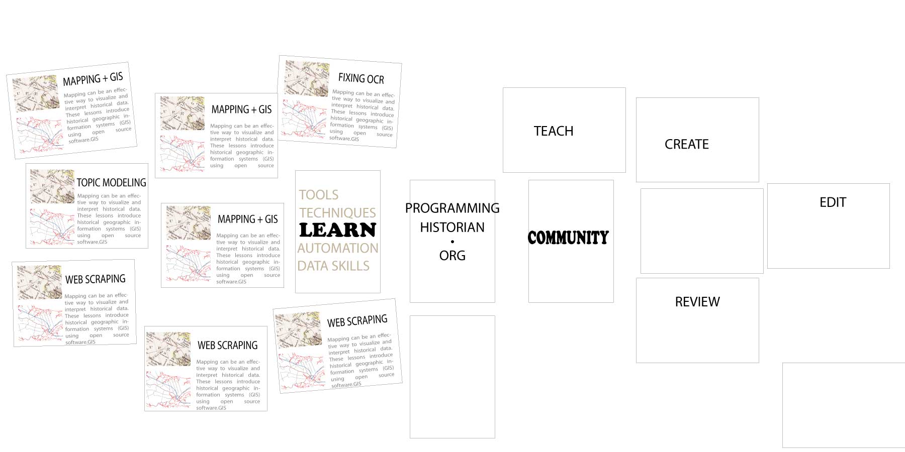
It’s always good to do things at least twice, right? Fast forward to another poster at AHA 2019 Chicago. A little more color and typographic styling, and bigger panels, but I found the same basic idea was perfectly effective for how to organize the visual display. There’s obviously more going on in the poster (and in the material being presented), so it takes a bit more effort to engage with it. But judging by the response, no one minded.

