Making a Map with QGIS
Introduction
This is the first of three tutorials on getting started with QGIS, covering the basic skills of loading data to create maps, styling the data to make the maps more readable, and visualizing data on historic maps. The tutorials build on each other, so saving your work as you proceed through the tutorials will help you pick up wherever you need to leave off.
Troubleshooting
If (= when), during your QGIS adventures, you get stuck or have questions, consult the QGIS Training Manual, the QGIS wiki, and an array of tutorials. You may not at first find exactly what you’re looking for, but it’s worth browsing through these sites to help sort out conceptual misunderstandings. Be aware that many tutorials are for older versions of QGIS, so the screen shots and menu labels may not match exactly what you see in your version—but the concepts are generally the same.
Also, remember that Google searches are your friend. You’re not the first one to haul yourself up the learning curve of QGIS; many people have likely posted similar questions on forums where someone eventually provided a useful explanation. Others have written tutorials or blog posts that can shed light on your issue. This kind of searching also helps you better understand the tool and build your vocabulary for how to search and solve problems on your own.
Installing QGIS
This tutorial has been updated for 3.8 (Zanzibar) for Mac, though some images are from previous versions if they are not significantly different from the current release. Other than installation instructions, there should be no noticeable difference between Mac and PC versions.
Latest vs Long Term Release
The “latest release” of QGIS with give you the most functionality and absolutely most recent version, but with the potential for bugs that haven’t been fixed or discovered yet. The “long term release” will be a bit older (sometimes significantly) and therefore without the latest features, but with greater stability. For most users, it really doesn’t matter, and it doesn’t for these tutorials.
The most up to date versions of the necessary components can be found, organized by operating system, at the QGIS download page. You’ll notice that QGIS installs several components (like GRASS) that are separate from QGIS itself but required for it to run (a standard feature of open source software)
Windows users: You will need to choose between the 32-bit or 64-bit versions based on your particular operating system. If you don’t already know which one you have, you can figure it out.
Be Explicit
When you first start QGIS you’ll get a whole lot of blank space, a bunch of cryptic icons, and pangs of regret and/or fear. It’s intimidating, but we can fix that by jumping right into making a map.
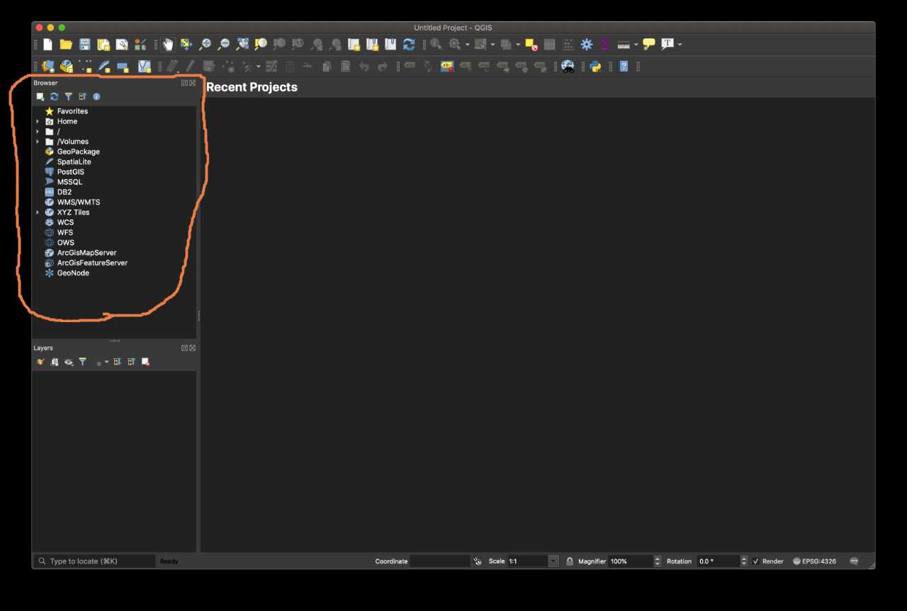
On the left pane of the application window, if you see a “Browser” panel (which for connecting to data sources) you can click the ‘X’ to close it, since we won’t be using it. Be sure to keep the “Layers” panel visible.
Many people expect to see a map, and are frustrated when they don’t. QGIS is a powerful but general mapping tool; broad tools of this nature tend not to do much without explicit instructions from you. Using these tools successfully often means adjusting your expectations of what they should do automatically. If you’re constantly comparing what the tool actually does to what you are assuming it should do, you’ll often feel like the tool isn’t right for you because of erroneous expectations. If you are disappointed there is no map, you should ask yourself why you expected to see a map. After all, we haven’t given the tool any data to display.
Data, not maps
The first thing to recognize is that GIS software doesn’t display maps, it displays data (most of which will have strong geographic ties). You must assemble and create your own map from the relevant geographic and social data you’re interested in. This might sound annoying, but it’s actually incredibly powerful. We walk through the basics in this tutorial.
The second thing to recognize is that GIS tools are NOT only for projects primarily about landscape or geography. Whether you’re thinking about people, commodities, ideas, political power, or whatever, almost everything has some grounding in space, which is overlaid with various features (such as transportation networks like roads or railroads, political boundaries, access to natural resources, wealth disparity, demographic data, etc). While these features might not be a direct concern of yours, they can add extremely useful context to your research and analysis. Before easily accessible data and GIS software, the work to create such maps far exceeded the (often unknown) benefit. The barrier now is far, far lower.
Acquire Data
Let’s start making a map! Following a typical and familiar example, let’s make a map of all the counties in the US. The first step in making any map is to find the data you need. One of the most common formats for GIS data is called a shapefile. The technical details are not important for us, but you can read more about the standard.
There are many places for finding GIS data online, but one important repository to keep on your radar is the Geography Program at census.gov. For this example, we can use 2018 data from this page that provides geographic data of many political boundaries, including U.S. counties.
Because it’s a warehouse of invaluable data, it’s worth clicking through the pages yourself to get a better sense of how census.gov works. Towards the bottom of the page, click the ‘Web Interface’ link, then use the ‘Select a layer type’ dropdown menu to choose ‘Counties (and equivalent)’. Click the ‘Submit’ button, then click ‘Download national file’. The file tl_2018_us_county.zip should save into your specified downloads directory (it’s about 75MB so it might take some time). If all else fails, you can also try this link to download the zip file.
Since we’re going to start acquiring and generating a set of files and folders, now is a good time to create a new folder somewhere on your hard drive to keep tutorial files organized, ideally a high-level location that’s easy to get to (like your Documents folder or Desktop; you can always move it later). Wherever you put them, your files should be in a stable and accessible place. It is a good idea to have separate folders for your working files (where you would save your QGIS project) separate from your data files (that you download from various sources), separate from image files (like historic maps). This isn’t strictly necessary, but it makes finding files and reusing them much easier as you accumulate and create more files.
Put the county.zip file in your new folder, and double click the downloaded file to unzip it. Once unzipped, you’ll notice that you actually get a folder full of files that reference each other rather than a single file. This is a standard way of packaging geographic data.
Add Some Data to the Map
On the bottom of the two toolbars at the top, click the leftmost icon to open the “Data Source Manager”.
Click “Vector” from the left menu. For “Source Type”, choose ‘Directory’ (since we want to point QGIS to the folder we downloaded). In the “Source” section, select U.S. Census TIGER/Line (a very standard kind of data as you will come to know). On the far right of the Vector Dataset(s) line, click the 3 dots to choose the folder where you unzipped your county.zip file.
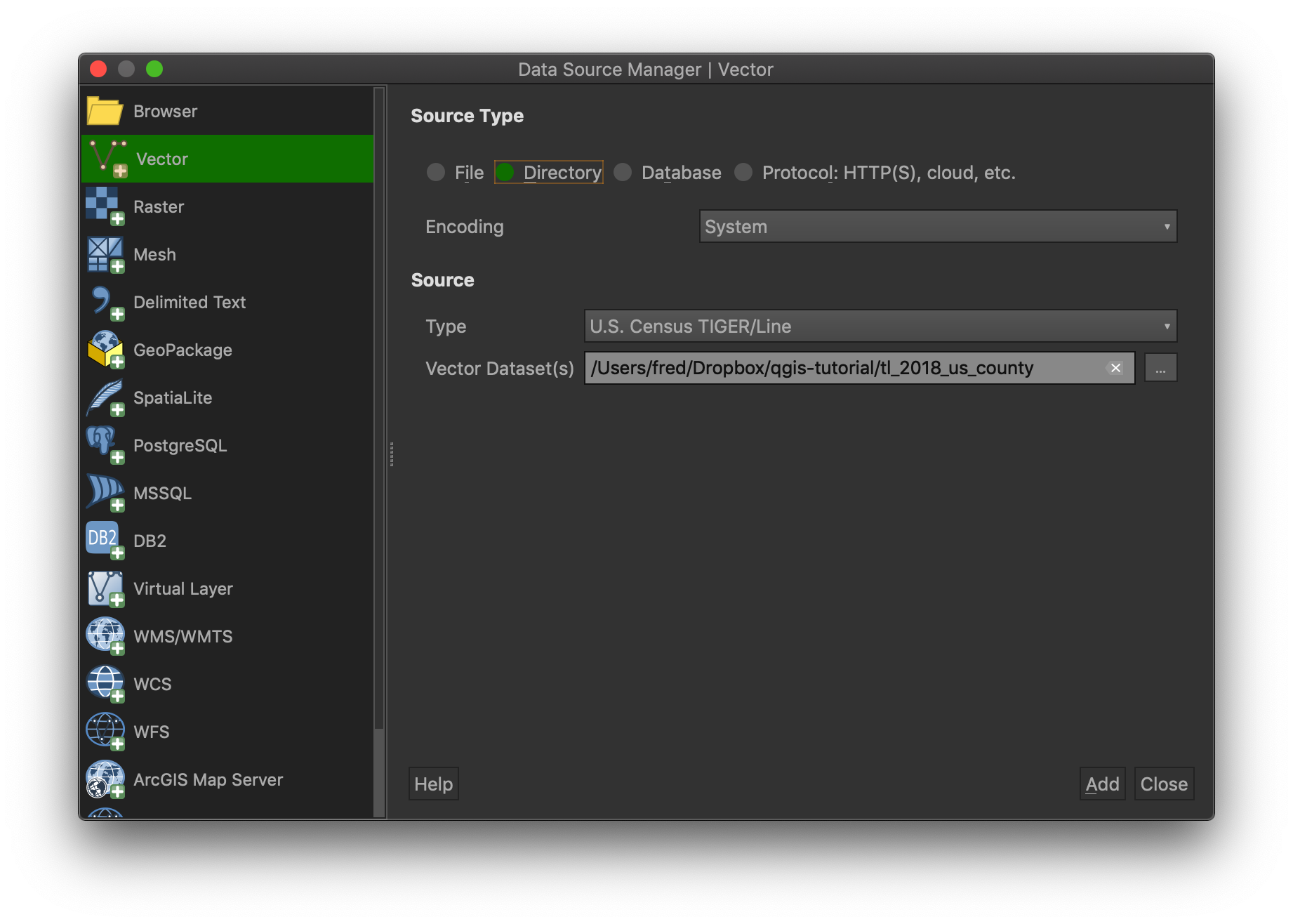
Click “Open” to choose your directory, then “Add” in the Data Source Manager window. You’ll then get a “Select Transformation” dialog, and you can click “OK” and accept the defaults. Click “Close” to get rid of the Data Source Manager window. You should see the outlines of all US counties.
Cool! You see that you’ve just created your first layer in QGIS with a shapefile you downloaded. The color of your map is likely different than the screenshot here, since QGIS chooses an arbitrary color to fill in the counties. We’ll adjust the color later. Notice that tl_2018_us_county appears in the Layers pane on the left.
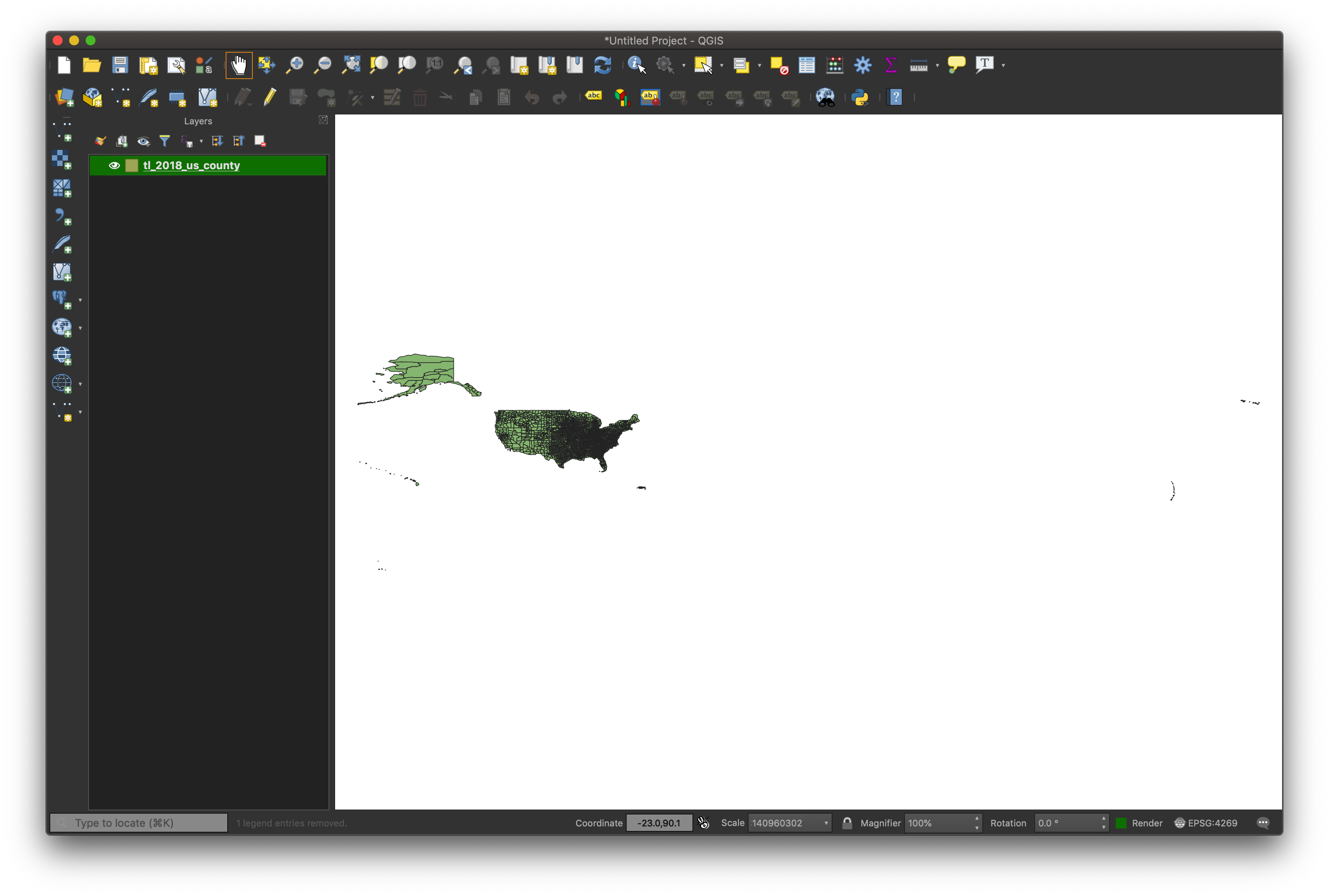
If you were expecting a beautifully colored and stylized map centered on the lower 48 (as are most county maps you see online), you may be a bit underwhelmed at this point. As mentioned earlier, this is not a limitation of QGIS, but a problem of expectations. All we asked it it do was display outlines of US counties, and that’s exactly what it did.
Note the very zoomed out view so that all of the Hawaiian islands and Guam can fit in the display area. To zoom in, you can use the scroll wheel of your mouse, or you can click the Zoom icon at the top and draw a rectangle onto an area you’d like to zoom in to (perhaps the continental US) to see the more familiar-looking boundaries at a smaller scale. Notice that because this is a vector image (and not a raster image like a JPG or PNG or TIF), the image doesn’t get fuzzier as you zoom in (QGIS simply redraws the image at the appropriate scale).
If you want to get back to your original zoom level, or you accidentally zoom super far in or out (it will happen eventually!), right-click on the layer name on the left in the Layers pane and select the topmost option, “Zoom to Layer”.
Digging a Bit Deeper
To see more of what’s behind the data we just loaded, right-click on the layer name again and select ‘Open Attribute Table’. You’ll see a spreadsheet-like table of data that comes as part of the directory you downloaded.
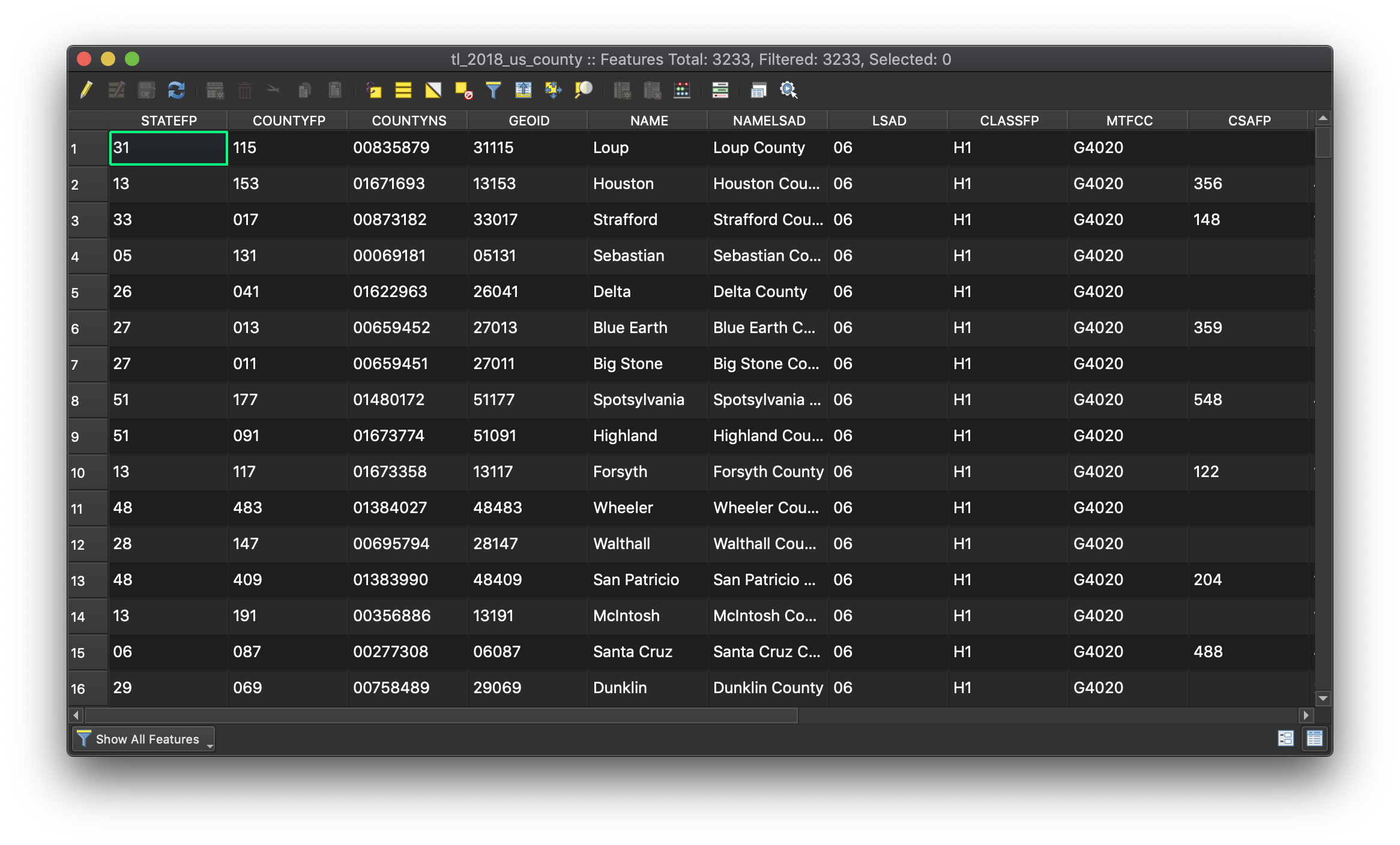
There are a bunch of codes and numbers that won’t mean much to you. However, you’ll notice that it also includes more intuitive data, like county names. Often data is provided in similar but different forms. There are two variants for county names, namely the NAME and NAMELSAD fields. These fields also allows us to join this dataset with other datasets (perhaps county population data) that also contain county names, which we’ll do in the next tutorial (linked at the bottom of this page).
Add Some Data to the Map
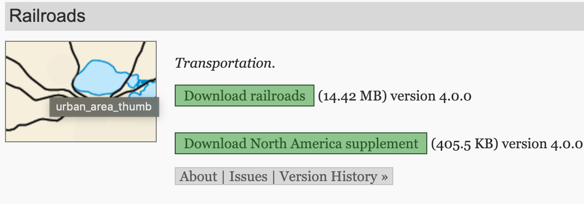
The real power of mapping tools like QGIS is the ability to layer data to visualize spatial relationships. The counties we displayed on the map are technically polygons, but let’s try loading a different data type. Instead of polygons, let’s load and display some lines. We can download data of existing railway lines at Natural Earth Data (another great data source you should always keep in mind). Scroll down until you get to Railroads, then download the North America Supplement.
Go through the same process as before (unzip the download file, open the Data Manager, choose your directory). Once you’ve added it to the map, zoom to the layer extent of the railroad layer and you’ll see the railroad lines atop of our counties. It looks a little weird that the railroad lines veer off into space, but remember that we downloaded only U.S. counties, but North American railroads. This is a frequent issue with combining data—rarely does everything line up perfectly—but it doesn’t need to. And we can always clean it up later.
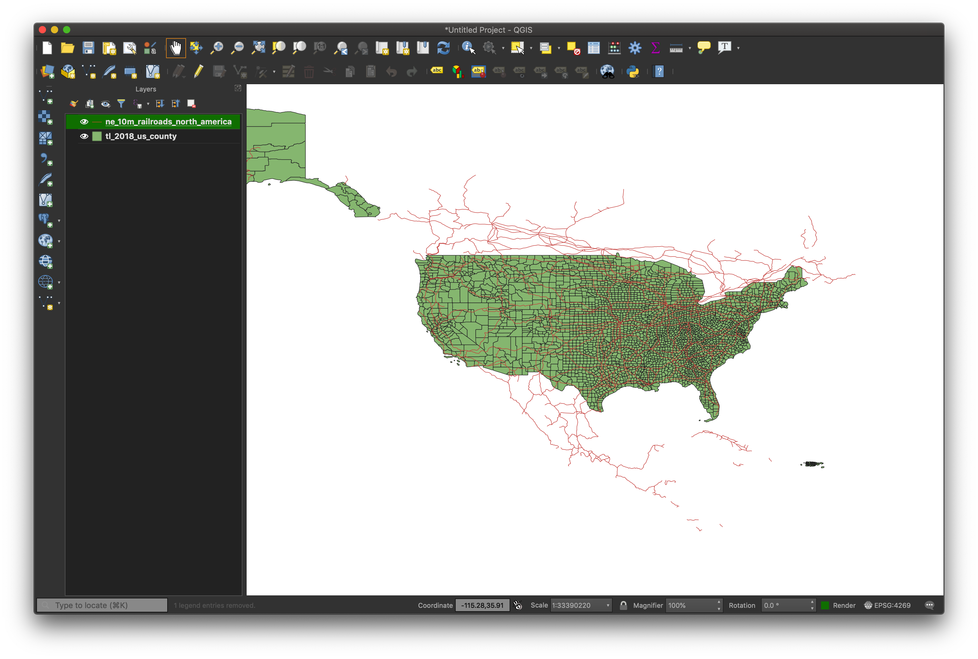
By this point we’ve loaded two kinds of data, one of polygons for our county boundaries, and one of lines for the railroads. This process of loading shapefiles is the same for displaying countries, bike trails, census tracts, or any other kind of physical or political boundary. There’s a LOT of data online that you can freely use to build your maps. You now have the power! Although not covered in these tutorials, you can also create your own shapefiles for use in different projects.
When you’re comfortable with the concepts covered here, move on to the next tutorial in the series, on linking and styling data.