Linking and Styling Data with QGIS
The first part of our tutorial covered some basics of loading vector data into QGIS.
Adding Complexity with More Data
The county map is a praise-worthy accomplishment if you’ve never made a map before. But obviously loading county boundaries with railroad lines is not super useful on its own.
You are now probably already realizing one of the principal challenges of GIS work. The actual display of the map is pretty easy—QGIS does all the work for you! The challenge lies in finding (or creating) the data you need, as well as making different data sets work with each other. An introductory tutorial is not the place to dive into the many different techniques, but let’s work through a typical and relatively straightforward example of combining data—in this case geographic and demographic data.
Get and Display Data
We already downloaded counties in the form of a shapefile; let’s see if we can add population data to our map.
This time, however, we are not going to use a shapefile because we’re not interested in drawing explicitly geographic features (like county boundaries); we’re interested in non-geographic data (like populations of counties).
We’ll get our data from census.gov again, at their page for population estimates. Click “Data” in the left nav bar, then “Datasets”. Scroll down to the second link under the big 2018 to click on “County Population Totals and Components of Change: 2010-2018”. Scroll all the way down to the bottom of the page to find a long link that starts with “Population, Population Change …” and has a green Microsoft-Excel-looking icon next to it. That links downloads the data you need.
You have now experienced how labyrinthine census.gov really is. There is a lot of tremendous data there, but it can take some perseverance to locate. If you skimmed over the directions for the census data, you can click here to get the file.
PRO TIP: The navigation links at census.gov often lead you in excruciatingly frustrating circles; a Google search is often the fastest way to find data you’re after. When you do find what you’re looking for, it’s worth making a bookmark rather than assuming you can find it again quickly. This is also why it’s useful to keep your data organized when you download it—so you don’t have to find it or download it again.
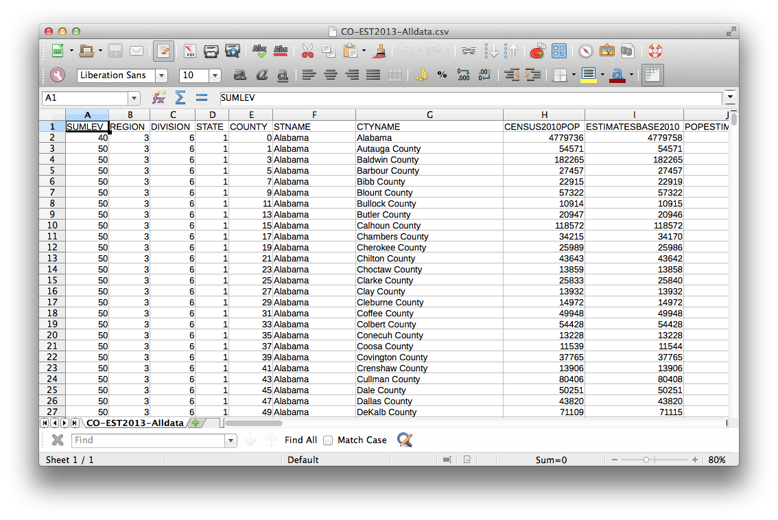
You just downloaded a CSV file, which stands for Comma Separated Values. You could load this into a spreadsheet, and it would look like:
You should put this file, co-est2018-alldata.csv with your other files for this tutorial.
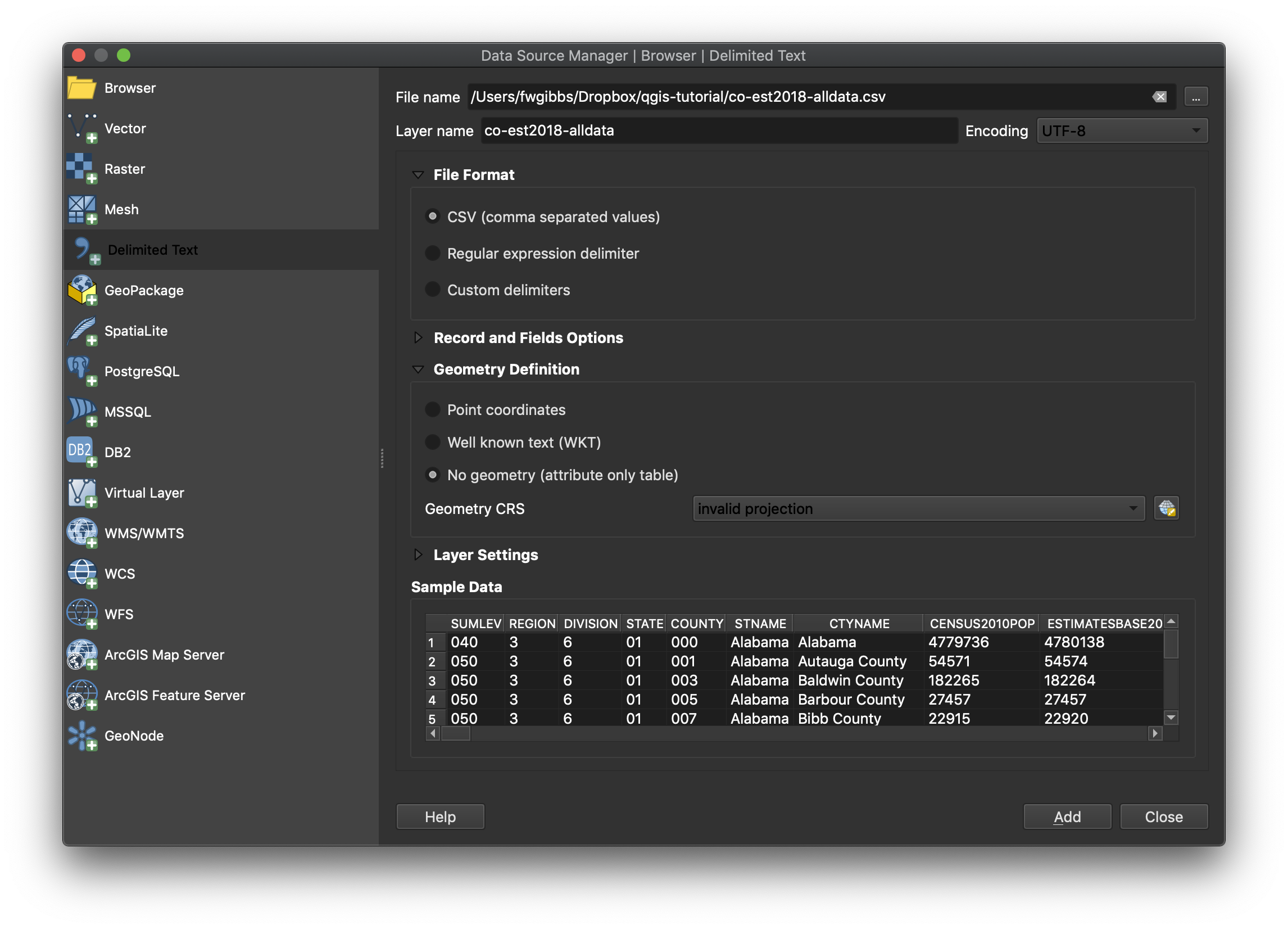
It’s possible to load some CSV files into QGIS by dragging and dropping them onto a QGIS window, but it’s better to follow a more explicit method. To load CSV data into QGIS, open the Data Source Manager again and on the left select “Delimited Text”. Click the three dots in the upper right to select the CSV file you just downloaded. In the File Format section, make sure CSV is selected (it should be the default). Notice that the preview pane on the bottom tells us how QGIS is interpreting the data in the file. If your CSV file isn’t properly formatted, or you’ve chosen options from this dialog that do not correspond to the CSV file, the preview will show you that something is wrong.
Especially if you’re someone who just likes to click “OK” without really paying attention, you’ll notice the “Add” button is grayed out to save you from yourself. Here’s why:
This CSV file contains data related to geography (population of counties), but does not contain any data to tell QGIS how to draw that geography (our other files did). In other words, the data is not specifically for mapping; it’s just data. So we need to tell QGIS not to look for any specific geographic data. Expand the Geometry Definition menu and select “No Geometry”. Now you can click “Add” and “Close” the Data Source Manager window.
You notice you have a new layer in the Layers pane, but we haven’t told QGIS what to do with this new data so our map looks exactly the same. More specifically, we have not indicated how this data relates to the county boundary map we’ve already loaded.
Let’s just check out the data first. Right click on the co-est2018-alldata layer and “Open Attribute Table”. Notice that our CSV file has loaded properly and contains lots of great data, like county name (the CTYNAME field), and the 2010 population (labeled as CENSUS2010POP) and various estimates for years since then. Take notice of the values in the CTYNAME field—they should look familiar.
Now, open the attribute table for our original map of the counties (so you’ll have two attribute tables open at once). You’ll notice that it, too, contains a field (fields are columns) listing all the county names, but in this file it’s called NAMELSAD. Our two datasets (the county geographic data and the population data) both have the county names, and it doesn’t matter that one is labeled as CTYNAME and the other as NAMELSAD because we can see (from just browsing through them) that the data is exactly the same (they both have county names with the same capitalization and the word “County” in each case. Because of this congruity, we can join these tables together so that we can visualize the population data on our county map. Close the attribute tables for now.
Joining Datasets Together
Double click on the original county map layer, or right click and select “Properties”, to bring up the Layer Properties dialog.
Click the “Joins” menu from the left. We want to add a new join (you can have many joins; we’re just going to do one). Click the green + icon in the lower left to start the process of creating a new join.
We want to join our original county map to the population data we just loaded. You’ll see the “Join Layer” field is already pre-filled with your co-est2018-alldata layer (because it’s the most recent one we’ve loaded). As we’ve already investigated, we want to link the two datasets by county name. Select the Join field as CTYNAME, which is the name of the column containing column names in our CSV file; for the Target field, select the corresponding column in the county layer table, which is NAMELSAD.
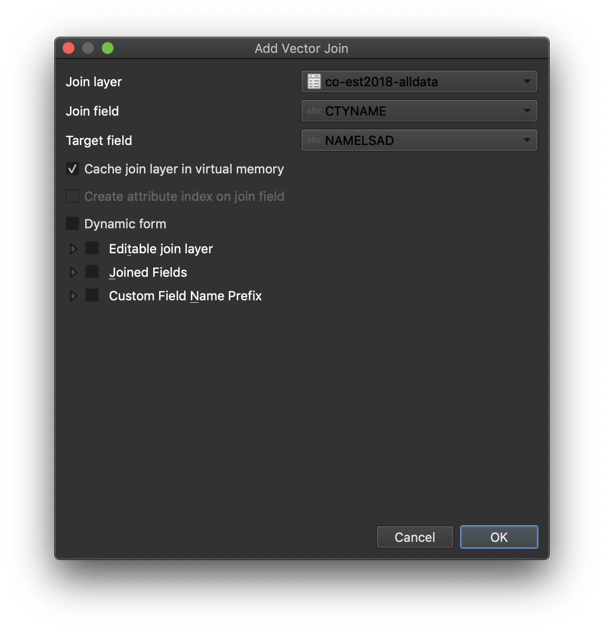
Click “OK” to close the Add Join dialog, then click “OK” to close the Joins dialog.
If you look at your map now, you might be dismayed to see that it looks exactly the same. But why should we expect it to be any different? We’ve created a link between two fields, but haven’t told QGIS what it should do with the new data (the county census data) that we’ve linked to the original county shapefile layer. Creating the join between datasets and telling QGIS what to do with the population data are two distinct steps.
Before we try to visualize the county population data, we should double check that our join has worked. Bring up the attribute table for our original layer (tl_2018_us_county), scroll to the right, and notice that all of the data from the CSV file has been added to our original attribute table. You can also see how QGIS names the columns to indicate where the data comes from—the CENSUS2010POP field is now labeled as co-est2018-alldata_CENSUS2010POP (the CSV filename prepended to the original field name). Close the attribute table.
Styling the Map Based on Data
Now on to the second step of useful joins: making our new population data visible. QGIS makes it easy to automatically style data and therefore make visual analysis much easier. To illustrate, let’s style our map so that the counties are color coded by population size (let’s have lighter shades indicate lower populations; darker shades indicate higher populations).
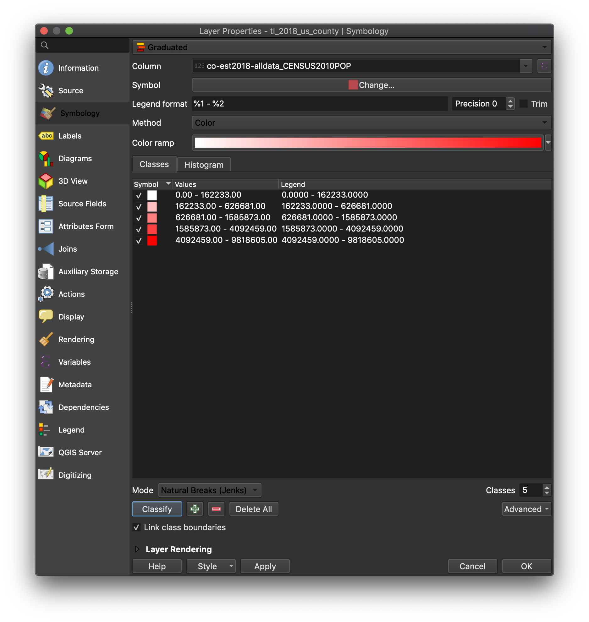
Return to the Properties menu of the original map. Click the Symbology Tab.
What the hell is “symbology”? Well, you noticed that all our counties are simply filled in with the same color (mine is light green). So we’re representing the area of a county with a “Single Symbol,” which is to fill our polygons (in this case counties) with a single color.
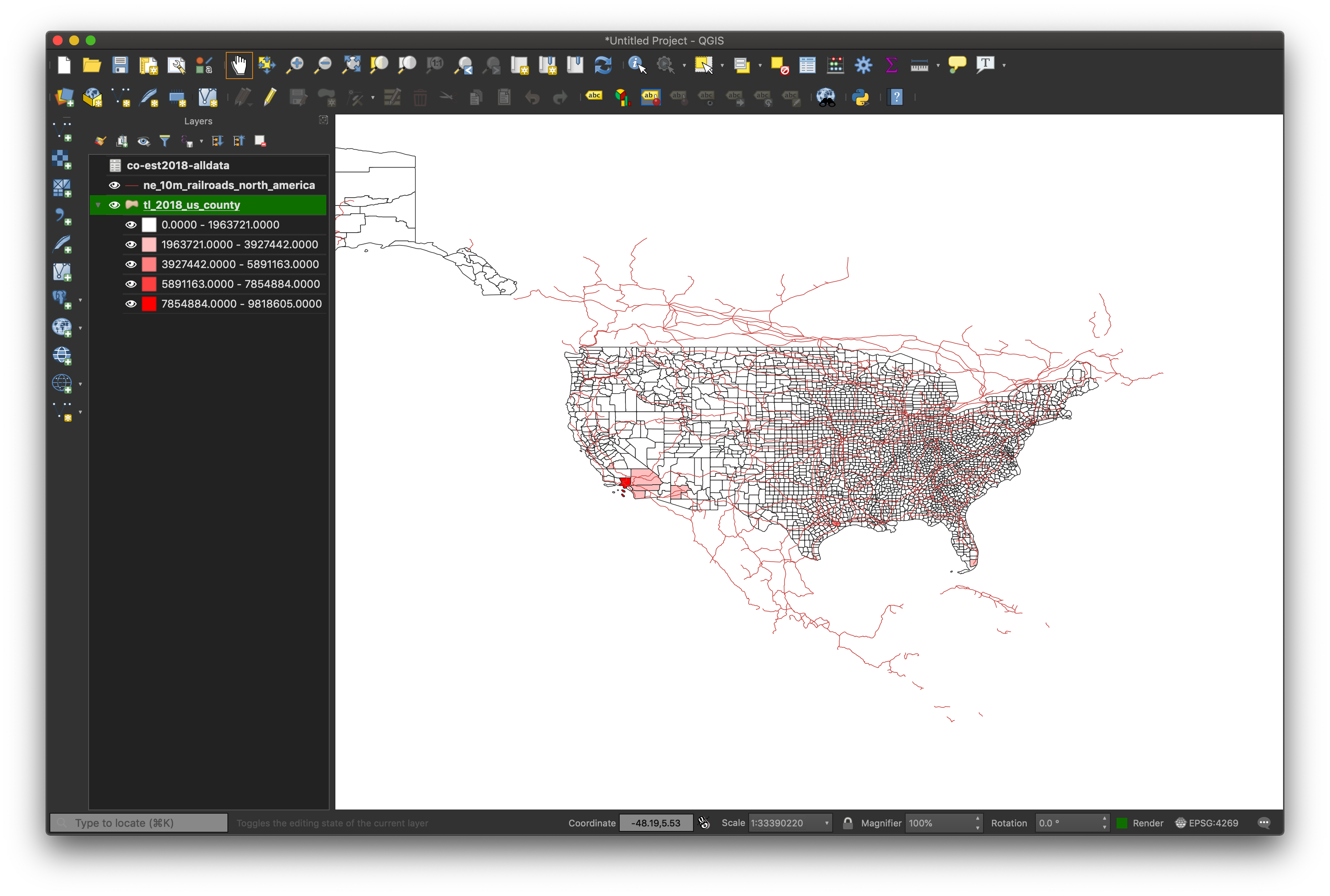
At the very top of the dialog box, you can see “Single Symbol”. Instead of the default Single Symbol (which means that all counties get filled with the same color), choose Graduated. You’ll notice that a Color ramp appears (mine goes from white to bright red).
Now we need to tell QGIS what data it should style. We’re going to use the total population of the county (originally from the CSV file but now also available via the county layer because of our join).
From the Column dropdown menu (the second field from the top), click on the arrow to select the column labeled co-est2018-alldata\_CENSUS2010POP. If you get impatient here and click “OK”, you’ll see that your counties disappear.
Click “Classify”. This will assign a color to ranges of population data based on the data from our CENSUS2010POP field).
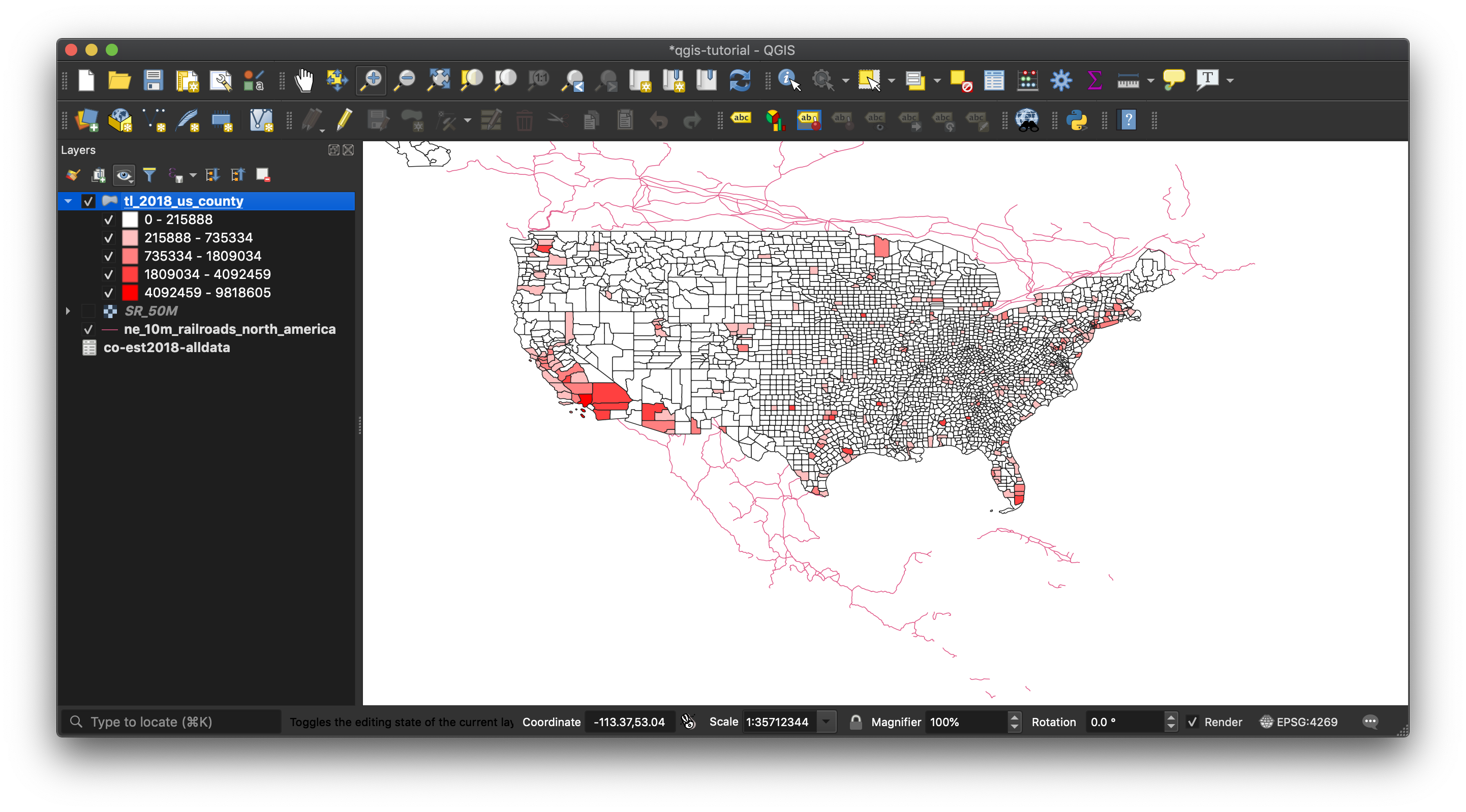
Click “OK” and you’ll see finally a new map and the color coding at work.
You probably expecting something more interesting and/or useful. This is not an uncommon feeling when dealing with data and tools like QGIS, especially when learning them.
What happened? QGIS did exactly what we said to do. So let’s be a bit more thoughtful about how we can style our data.
Bring up the properties dialog again. Notice the “Mode” dropdown box near the bottom. It’s set to “Equal Interval”. This is a classification scheme that equally divides our range of data (roughly 0 - 10,000,000) into bins with equal ranges (in this case roughly 2 million, so we have separate colors for roughly 0-2 million, 2-4 million, and so on). This is evident from the “Classes” window in the middle of the dialog box. This means that since virtually all counties in the U.S. have less than 2 million people, most everything is shaded the lightest color.
Let’s change the “Mode” to something that better fits our data, like “Natural Breaks (Jenks)”. Basically this algorithm tries to find natural groupings in the data (up to the number of groups we specify, which is 5 by default). Users should click “Classify” again after selecting “Natural Breaks (Jenks)”.
Click “OK” to re-render the map. This is better, and also a pretty striking visualization of how sparsely populated most counties are.
When you’re comfortable with the concepts covered here, move on to the next tutorial in the series, on overlaying historic maps with QGIS.